Tuesday, January 6, 2015

Mixed Media

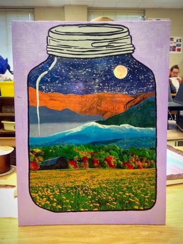
For my mixed media project, I decided to create a jar with different types of landscapes inside of it. First, I used pencil to outline the jar and then used gel to attach various pictures of landscapes that I found in magazines to the interior part of the jar. I then used black paint and  a fine tipped brush to outline the jar and add dimension to the lid. I also added color to the pictures, such as the red in the trees, or the white snow on the mountain tops. By doing this, I was able to add more value and dimensions to each part. Next, I used a chunky glitter on the sky portion, to look like stars. Initially, I wanted a finer glitter, but wasn't able to find any, so I used the chunkier glitter and I actually like the way it turned out more. After doing this, I added a pearlescent paint to the moon and the white glare, which is the same shape as the jar in white on the left side. Then, I painted the background light purple mixed with the pearlescent again so it was a little shimmery. Lastly, I put gel over the entire thing to seal it in and ensure that the magazine cut outs would not peel off. Over all, I'm very happy with the way this project turned out. It is probably one of my favorites that we did all semester and I really like the amount of freedom and flexibility we had in choosing what we wanted out project to be. 

Wednesday, December 3, 2014

Up-Close Abstract

For this project, we were assigned to chose an object to draw up close with colored pencils, chalk pastels, or oil pastels. I chose to draw a piece of sushi, and utilize the colored pencils on black paper. I like the way the use of black paper turned out, because I was able to use a lot of value and detail to each part of the sushi. I did not, however, like the rice. i think this was mainly because  it didn't come out the way it was in my head. It was also hard for me to ad value to the grains of rice because each grain is the same color for the most part and that kind of threw me off as to where to have shadows and which shade of black or brown to use to add darkness. It was also difficult because I wasn't able to add a seperate color as the highlight. Since the rice is already white, I had to rely on shadows to make them three dimension. Overall, I liked this project a lot because I got to use the prismacolors on black paper, which was a new experience and I was able to try new techniques on a bigger, more detailed scale. 

Tuesday, December 2, 2014

Clay Food

For the clay food project, our table was given the topic of dessert. my initial ideas were Christmas cookies, cupcakes, and ice cream. Ultimately, I chose Christmas cookies. I brought in metal cookie cutters to cut the clay into my desired shapes. I decorated each cookie individually and used glaze to achieve the colors I wanted. If I were to do this project again, I would use a different glaze for the gingerbread man that has sunglasses. The glaze I used ended up lookin patchy and uneven. I would have also probably roughed up the edges so each cookie looked more realistic and less clean cut, like clay. However, I would still use the same cookie cutters and glazes. 

Monday, November 10, 2014

Chalk, Pastels, & Colored Pencils


Which medium was your favorite?
My favorite medium was colored pencils. For me, they were easiest to blend and add value. I was able to have the most control with the amount of color I used, and add shadows easily. I also liked using black paper with colored pencils because it made each color stand out most and with much vibrancy. Previously, I didn't realize how colored pencils could be used to make realistic art, but after using the prismacolors and being taught how to properly used, I would like to use them more and more in my art. 
What did you find the most difficult?
For me, using the chalk pastels was the most difficult. It was really hard for me add value to the wrapper with all of the chalk dust. It was also difficult to keep the lines clean and even. Another problem with chalk pastels was that the chalk would get on your fingers, and make it difficult to keep the colors separated, and not completely blend together.

Wednesday, October 22, 2014

Painting in the Style of Rosenquist

           My painting is in the style of James Rosenquist. I used mod podge to attach pictures I printed and took of Costa Rica. I then used acrylic paint to change the background color and add additional highlights, shades, and value. I also used the paint to blend the parts together, as Rosenquist did. In his early years, Rosenquist was a billboard painter. He received many grants and scholarships in his life to attend multiple schools and universities. After starting and becoming successful in art, He became a full time artist. His artwork is considered a part of the pop-art era. He used collages of random things and blended them together with bright colors.

Tuesday, September 23, 2014

Project 1: APA


This project is entitled APA, which stands for Academy of the Performing Arts. APA is my dance studio, and source of inspiration. It is very important to me as a spend much of my time there. I used colored pencils to achieve the color and value in my project. I used pictures of the lobby and signs at APA to help me accurately draw it. Initially, I wasn't sure which of the three thumbnails I would use, but I am glad I chose this picture. While doing this project, I learned a lot about using colored pencils and creating value and shadows by using different colors. In all, I am really happy with the way it turned out and the amount of detail and value I was able to put in. If I could change anything, I would even out the lines and make the ceiling tiles line up a bit more.